In dit labo maken we een verkennende analyse van open data van Uber. Terloops maken we kennis met de Pandas en Plotly bibliotheken.
import os

import kagglehub
import pandas as pd
# Download data from kaggle
path = kagglehub.dataset_download("yashdevladdha/uber-ride-analytics-dashboard")

# Load data into Pandas DataFrame
csv_file = os.path.join(path, "ncr_ride_bookings.csv")
df = pd.read_csv(csv_file)
print("✅ Data loaded successfully!")
✅ Data loaded successfully!
We hebben de data nu ingeladen als een Pandas DafaFrame (denk: Excel sheet 🫣)
print(df.__class__.__name__)DataFrame
We kunnen snel de eerste of laatste rijen van de DataFrame bekijken via .head() en .tail.
# Inspect first 5 rows
df.head()# Inspect last 2 rows
df.tail(2)We kunnen snel een idee krijgen van het aantal rijen via len()
print(f"📈 Total rides: {len(df):,}")📈 Total rides: 150,000
Zoals bij NumPy, is er ook een .shape methode, maar die genereert enkel 2 dimensionele tuples.
print(f"📊 Dataset shape: {df.shape}")
nrow, ncol = df.shape
print(f" - rows: {nrow:,}")
print(f" - columns: {ncol:,}")
📊 Dataset shape: (150000, 21)
- rows: 150,000
- columns: 21
Kolomnamen zijn beschikbaar als een speciaal Index object via .columns
df.columnsIndex(['Date', 'Time', 'Booking ID', 'Booking Status', 'Customer ID',
'Vehicle Type', 'Pickup Location', 'Drop Location', 'Avg VTAT',
'Avg CTAT', 'Cancelled Rides by Customer',
'Reason for cancelling by Customer', 'Cancelled Rides by Driver',
'Driver Cancellation Reason', 'Incomplete Rides',
'Incomplete Rides Reason', 'Booking Value', 'Ride Distance',
'Driver Ratings', 'Customer Rating', 'Payment Method'],
dtype='object')De .info() methode geeft een nuttig overzicht van de kolommen en data types.
Merk op dat er voor sommige variabelen ontbrekende (niet-geregistreerde) waarden zijn (zogeheten missing values; zie Non-Null Count < 15000; bv. Customer Rating).
df.info()<class 'pandas.core.frame.DataFrame'>
RangeIndex: 150000 entries, 0 to 149999
Data columns (total 21 columns):
# Column Non-Null Count Dtype
--- ------ -------------- -----
0 Date 150000 non-null object
1 Time 150000 non-null object
2 Booking ID 150000 non-null object
3 Booking Status 150000 non-null object
4 Customer ID 150000 non-null object
5 Vehicle Type 150000 non-null object
6 Pickup Location 150000 non-null object
7 Drop Location 150000 non-null object
8 Avg VTAT 139500 non-null float64
9 Avg CTAT 102000 non-null float64
10 Cancelled Rides by Customer 10500 non-null float64
11 Reason for cancelling by Customer 10500 non-null object
12 Cancelled Rides by Driver 27000 non-null float64
13 Driver Cancellation Reason 27000 non-null object
14 Incomplete Rides 9000 non-null float64
15 Incomplete Rides Reason 9000 non-null object
16 Booking Value 102000 non-null float64
17 Ride Distance 102000 non-null float64
18 Driver Ratings 93000 non-null float64
19 Customer Rating 93000 non-null float64
20 Payment Method 102000 non-null object
dtypes: float64(9), object(12)
memory usage: 24.0+ MB
Niet alle waarden zijn numeriek (bv. Time, Vehicle Type, Pickup Location)
df[["Time", "Vehicle Type", "Pickup Location", "Avg VTAT"]].head()Via de .describe() methode krijgen we snel een overzicht van de centrale tendensen.
df.describe()Zoals in NumPy kunnen we een simpele transpose aanroepen.
df.describe().TIedere kolom kan apart als een Series object aangeroepen worden.
df.Time0 12:29:38
1 18:01:39
2 08:56:10
3 17:17:25
4 22:08:00
...
149995 19:34:01
149996 15:55:09
149997 10:55:15
149998 07:53:34
149999 15:38:03
Name: Time, Length: 150000, dtype: objectdf.Time.__class__.__name__'Series'df["Booking Status"]0 No Driver Found
1 Incomplete
2 Completed
3 Completed
4 Completed
...
149995 Completed
149996 Completed
149997 Completed
149998 Completed
149999 Completed
Name: Booking Status, Length: 150000, dtype: objectIedere Series is onderliggend een gewone NumPy array. Die kan je op elk moment oproepen via .values
df.Time.valuesarray(['12:29:38', '18:01:39', '08:56:10', ..., '10:55:15', '07:53:34',
'15:38:03'], shape=(150000,), dtype=object)df.Time.values.__class__.__name__'ndarray'Meer complexe indexering kan via .loc en .iloc syntax.
df["Vehicle Type"] == "Uber XL"0 False
1 False
2 False
3 False
4 False
...
149995 False
149996 False
149997 False
149998 False
149999 False
Name: Vehicle Type, Length: 150000, dtype: booldf.loc[df["Vehicle Type"] == "Uber XL", ("Time", "Vehicle Type", "Pickup Location", "Avg VTAT")](
df.loc[
df["Vehicle Type"] == "Uber XL", ("Time", "Vehicle Type", "Pickup Location", "Avg VTAT")
].reset_index(drop=True)
)df.loc[
(df["Vehicle Type"] == "Uber XL")
| (df["Vehicle Type"] == "Bike"), # or df["Vehicle Type"].isin(["Uber XL", "Bike"])
("Time", "Vehicle Type", "Pickup Location", "Avg VTAT"),
]df.iloc[100:105, [0, 1, 3, 5]]We kunnen op verschillende manieren data aggregeren. Zie documentatie voor meer info.
df.agg({"Time": ["min", "max"], "Avg VTAT": ["min", "max", "mean"]})Het resultaat is telkens terug een DataFrame of Series.
# An indexed series of missing value counts
na_counts = df.isnull().sum()
na_counts
Date 0
Time 0
Booking ID 0
Booking Status 0
Customer ID 0
Vehicle Type 0
Pickup Location 0
Drop Location 0
Avg VTAT 10500
Avg CTAT 48000
Cancelled Rides by Customer 139500
Reason for cancelling by Customer 139500
Cancelled Rides by Driver 123000
Driver Cancellation Reason 123000
Incomplete Rides 141000
Incomplete Rides Reason 141000
Booking Value 48000
Ride Distance 48000
Driver Ratings 57000
Customer Rating 57000
Payment Method 48000
dtype: int64na_counts.__class__.__name__'Series'na_counts.indexIndex(['Date', 'Time', 'Booking ID', 'Booking Status', 'Customer ID',
'Vehicle Type', 'Pickup Location', 'Drop Location', 'Avg VTAT',
'Avg CTAT', 'Cancelled Rides by Customer',
'Reason for cancelling by Customer', 'Cancelled Rides by Driver',
'Driver Cancellation Reason', 'Incomplete Rides',
'Incomplete Rides Reason', 'Booking Value', 'Ride Distance',
'Driver Ratings', 'Customer Rating', 'Payment Method'],
dtype='object')na_counts["Customer Rating"]np.int64(57000)We kunnen gebruik maken van ingebouwde visualisatiemogelijkheden...
fig = na_counts.plot(kind="barh", title="Missing Value Counts")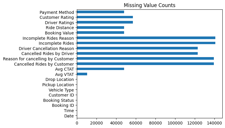
of onze eigen (rijkere) visualisaties maken met Plotly voor exploratieve data analyse (EDA).
import plotly.express as pxfig = px.bar(na_counts, title="Missing Value Counts")
fig.show()# Number of rides per vehicle type with different colors per type
fig = px.bar(
df["Vehicle Type"].value_counts(),
title="Number of Rides per Vehicle Type",
color=df["Vehicle Type"].value_counts().index,
)
fig.show()# Driver Ratings histogram
fig = px.histogram(df, x="Driver Ratings", nbins=20, title="Driver Ratings Histogram")
fig.show()Analyse van Avg CTAT: Average trip duration from pickup to destination (in minutes)
fig = px.scatter(df, x="Time", y="Avg CTAT", color="Vehicle Type", title="Avg VTAT over Time")
fig.show()Dit is duidelijk niet zo informatief ... wat missen we?
Eenduidige timestamps (datum + tijd)
df.head()df["Date"].astype(str) + " " + df["Time"].astype(str)0 2024-03-23 12:29:38
1 2024-11-29 18:01:39
2 2024-08-23 08:56:10
3 2024-10-21 17:17:25
4 2024-09-16 22:08:00
...
149995 2024-11-11 19:34:01
149996 2024-11-24 15:55:09
149997 2024-09-18 10:55:15
149998 2024-10-05 07:53:34
149999 2024-03-10 15:38:03
Length: 150000, dtype: object# New date time column
df["DateTime"] = pd.to_datetime(df["Date"].astype(str) + " " + df["Time"].astype(str))
df["DateTime"].head()0 2024-03-23 12:29:38
1 2024-11-29 18:01:39
2 2024-08-23 08:56:10
3 2024-10-21 17:17:25
4 2024-09-16 22:08:00
Name: DateTime, dtype: datetime64[ns]fig = px.scatter(df, x="DateTime", y="Avg CTAT", color="Vehicle Type", title="Avg VTAT over Time")
fig.show()Resampling en aggregatie per uur
avg_ctat_hourly = (
    df.loc[:, ["DateTime", "Avg CTAT", "Vehicle Type"]]  # select only relevant columns
    .set_index("DateTime")  # set datetime as index (needed to allow resampling)
    .resample("h")  # resample to hourly frequency
    # aggregate by mean for each hour and vehicle type
    .agg({"Avg CTAT": "mean", "Vehicle Type": "first"})
    .reset_index()  # reset index to get datetime back as a column
    .dropna()  # drop missing values
)

avg_ctat_hourlyfig = px.line(
avg_ctat_hourly, x="DateTime", y="Avg CTAT", color="Vehicle Type", title="Avg CTAT over Time"
)
fig.show()Subplots en smoothing
import plotly.graph_objects as go
from plotly.subplots import make_subplots
from statsmodels.nonparametric.smoothers_lowess import lowess
vehicle_types = df["Vehicle Type"].unique()
fig = make_subplots(rows=len(vehicle_types), cols=1)
for i, vehicle_type in enumerate(vehicle_types, start=1):
x = avg_ctat_hourly.loc[avg_ctat_hourly["Vehicle Type"] == vehicle_type, "DateTime"]
y = avg_ctat_hourly.loc[avg_ctat_hourly["Vehicle Type"] == vehicle_type, "Avg CTAT"]
# Scatter
fig.add_trace(go.Scatter(x=x, y=y, name=vehicle_type, mode="lines"), row=i, col=1)
# LOWESS smoothing
lowess_result = lowess(y, x, frac=0.02) # frac controls smoothing
lowess_x = lowess_result[:, 0]
lowess_y = lowess_result[:, 1]
fig.add_trace(
go.Scatter(
x=x, y=lowess_y, name=f"{vehicle_type} (LOWESS)", mode="lines", showlegend=False
),
row=i,
col=1,
)
fig.update_layout(height=300 * len(vehicle_types), title_text="Avg CTAT over Time by Vehicle Type")
fig.show()Aggregatie per uur van de dag
df["Hour"] = df["DateTime"].dt.hour
df_agg_hourly = (
    df.groupby(["Hour", "Vehicle Type"])["Avg CTAT"]  # group by hour and vehicle type
    .mean()  # aggregate by mean
    .reset_index()  # reset index to get hour and vehicle type back as columns
)

df_agg_hourly.head()fig = px.line(
df_agg_hourly, x="Hour", y="Avg CTAT", color="Vehicle Type", title="Avg CTAT by Hour of Day"
)
fig.show()# box plot for Premier Sedans per hour of the day
fig = px.box(
df.loc[df["Vehicle Type"] == "Premier Sedan", :],
x="Hour",
y="Avg CTAT",
title="Avg CTAT Distribution for Premier Sedans by Hour of Day",
)
fig.show()Idem, maar per dag van de week.
# Day of the week
df["DayOfWeek"] = df["DateTime"].dt.day_name()

fig = px.box(
    df.loc[df["Vehicle Type"] == "Premier Sedan", :],
    x="DayOfWeek",
    y="Avg CTAT",
    title="Avg CTAT Distribution for Premier Sedans by Day of Week",
)
fig.show()We bekijken de verdeling van de Booking Status
# Helper function to categorize booking status
def categorize_status(status):
    """Categorize booking status into Completed, Cancelled, No Driver Found, Other."""
    if status == "Completed":
        return "Completed"
    if "Cancelled" in str(status):
        return "Cancelled"
    if status == "No Driver Found":
        return "No Driver Found"
    return "Other"
# Create new status variable using .apply
df["Status_Category"] = df["Booking Status"].apply(categorize_status)fig = px.pie(df, names="Status_Category", title="Booking Status Distribution")
fig.show()Per type voertuig
# Booking status by vehicle type
df_booking_status = df.groupby(["Vehicle Type", "Booking Status"]).size().reset_index(name="Count")

fig = px.bar(
    df_booking_status,
    x="Vehicle Type",
    y="Count",
    barmode="group",
    title="Number of Rides per Vehicle Type",
    color="Booking Status",
)
fig.show()Correlaties
# Correlations between numerical variables
df_num = df.loc[
    :,
    ("Avg VTAT", "Avg CTAT", "Booking Value", "Ride Distance", "Driver Ratings", "Customer Rating"),
]
df_num.dropna(inplace=True)  # drop rows with missing values

df_num.corr()# Box plot with booking value per vehicle type
fig = px.box(
df,
x="Vehicle Type",
y="Booking Value",
title="Booking Value Distribution per Vehicle Type",
log_y=True,
)
fig.show()