Oorspronkelijk werden vectoren in de meetkunde en de mechanica geïntroduceerd om grootheden voor te stellen die zowel een grootte als een richting hebben, zoals verplaatsingen, krachten, versnelling, enz. In dezelfde context werden matrices gebruikt om lineaire transformaties tussen vector-ruimtes voor te stellen. In Machine Learning worden vectoren, matrices en tensors veel algemener gebruikt als containers voor data en model parameters omwille van:
computationele efficiëntie
speciale tensors en tensor-operaties (bv. rotatie-matrices, convolutionele filters, decompositie, enz.)
compacte notatie (zowel in tekst als programmacode)
Toepassingen[1]
Feature matrix voor tabelgegevens
In veel gevallen vertrekken we van data in een tabel formaat (denk aan een Excel sheet) waarbij iedere cel voor een bepaalde eigenschap staat (bv. lengte, leeftijd) van een bepaald item (bv. student). Verschillende items komen overeen met verschillende rijen en verschillende eigenschappen met verschillende kolommen.
Source
import os

import kagglehub
import pandas as pd
# Download data
path = kagglehub.dataset_download("yashdevladdha/uber-ride-analytics-dashboard")
# Load data into Pandas DataFrame
csv_file = os.path.join(path, "ncr_ride_bookings.csv")
df = pd.read_csv(csv_file)
print("✅ Data loaded successfully!")✅ Data loaded successfully!
Machine Learning is een zaak van wiskunde en daarom moet alle informatie waarin we patronen willen herkennen vertaald worden naar numerieke waarden. Bij tabelgegevens hebben we doorgaans te maken met heel verschillende data-types. Voor sommige data types is de vertaling in numerieke waarden evident, zoals temperatuur of aandelenkoersen, maar in andere gevallen zijn er speciale voorbereidingen nodig. De manier waarop we informatie vertalen naar numerieke waarden bepaalt heel sterk welke patronen we al dan niet kunnen oppikken met het ML model. Het is onder andere belangrijk om rekening te houden met volgende aspecten:
Meetschaal
Niet-lineariteit
Cyclische informatie
Missing data
Meetschaal
Nominaal: De informatie laat toe om items in bepaalde categorieën te plaatsen (bv. “fruit” “groente” “vlees” “rond” “vierkant” )
Ordinaal: De informatie laat toe om items te ordenen (bv. “small” “medium” “large”)
Interval: De informatie laat toe om de afstand tussen items te bepalen (bv. )
Ratio: De informatie laat toe om de verhoudingen tussen items te bepalen (bv. )
Niet-lineariteit
Op een interval of ratio schaal kunnen we aan de hand van niet lineaire transformaties hetzelfde interval een ander gewicht geven naargelang de positie op de schaal. Voorbeelden zijn logarithmische transformatie, exponentiële transformatie en polynomiale transformatie.
Source
import matplotlib.pyplot as plt
import numpy as np
from sklearn.linear_model import LinearRegression
from sklearn.metrics import r2_score
Source
# Set random seed for reproducibility
rng = np.random.default_rng(123)

# Generate synthetic data: social media likes vs sales
# Create likes data with exponential distribution (more realistic)
n_samples = 200
likes_raw = rng.exponential(scale=5000, size=n_samples)
likes_raw = np.clip(likes_raw, 1, 500000)  # Clip to reasonable range

# Generate sales data with logarithmic relationship to likes + noise
# Sales = base_sales + log_coefficient * log(likes) + noise
base_sales = 1000
log_coefficient = 800
noise_std = 200
sales = base_sales + log_coefficient * np.log(likes_raw) + rng.normal(0, noise_std, n_samples)
sales = np.clip(sales, 0, None)  # Ensure non-negative sales

# Sort data for better visualization
sort_idx = np.argsort(likes_raw)
likes_sorted = likes_raw[sort_idx]
sales_sorted = sales[sort_idx]

# Prepare data for regression
X_raw = likes_sorted.reshape(-1, 1)
X_log = np.log(likes_sorted).reshape(-1, 1)
y = sales_sorted

# Fit linear regression models
model_raw = LinearRegression().fit(X_raw, y)
model_log = LinearRegression().fit(X_log, y)

# Make predictions
y_pred_raw = model_raw.predict(X_raw)
y_pred_log = model_log.predict(X_log)

# Calculate R² scores
r2_raw = r2_score(y, y_pred_raw)
r2_log = r2_score(y, y_pred_log)

# Create visualization
fig, (ax1, ax2) = plt.subplots(1, 2, figsize=(15, 6))

# Plot 1: Raw likes vs sales with linear regression
ax1.scatter(likes_sorted, sales_sorted, alpha=0.6, color="blue", s=30)
ax1.plot(
    likes_sorted, y_pred_raw, color="red", linewidth=2, label=f"Linear fit (R² = {r2_raw:.3f})"
)
ax1.set_xlabel("Social Media Likes")
ax1.set_ylabel("Sales (€)")
ax1.set_title("Linear Regression on Raw Likes Data")
ax1.legend()
ax1.grid(True, alpha=0.3)

# Plot 2: Log-transformed likes vs sales with linear regression
ax2.scatter(np.log(likes_sorted), sales_sorted, alpha=0.6, color="green", s=30)
ax2.plot(
    np.log(likes_sorted),
    y_pred_log,
    color="red",
    linewidth=2,
    label=f"Linear fit (R² = {r2_log:.3f})",
)
ax2.set_xlabel("Log(Social Media Likes)")
ax2.set_ylabel("Sales (€)")
ax2.set_title("Linear Regression on Log-Transformed Likes")
ax2.legend()
ax2.grid(True, alpha=0.3)

plt.tight_layout()
plt.show()

# Print results
print("\n📊 Regression Results:")
print(f"Raw likes model R² score: {r2_raw:.3f}")
print(f"Log-transformed likes model R² score: {r2_log:.3f}")
print(f"\n🎯 Improvement with log transformation: {((r2_log - r2_raw) / r2_raw * 100):.1f}%")

# Show the mathematical relationship
print("\n📈 Discovered relationship:")
print(f"Sales ≈ {model_log.intercept_:.0f} + {model_log.coef_[0]:.0f} × log(likes)")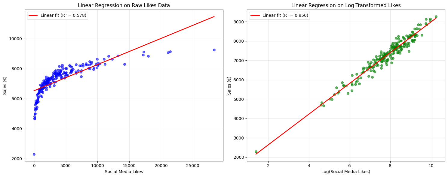
📊 Regression Results:
Raw likes model R² score: 0.578
Log-transformed likes model R² score: 0.950

🎯 Improvement with log transformation: 64.2%

📈 Discovered relationship:
Sales ≈ 1051 + 793 × log(likes)
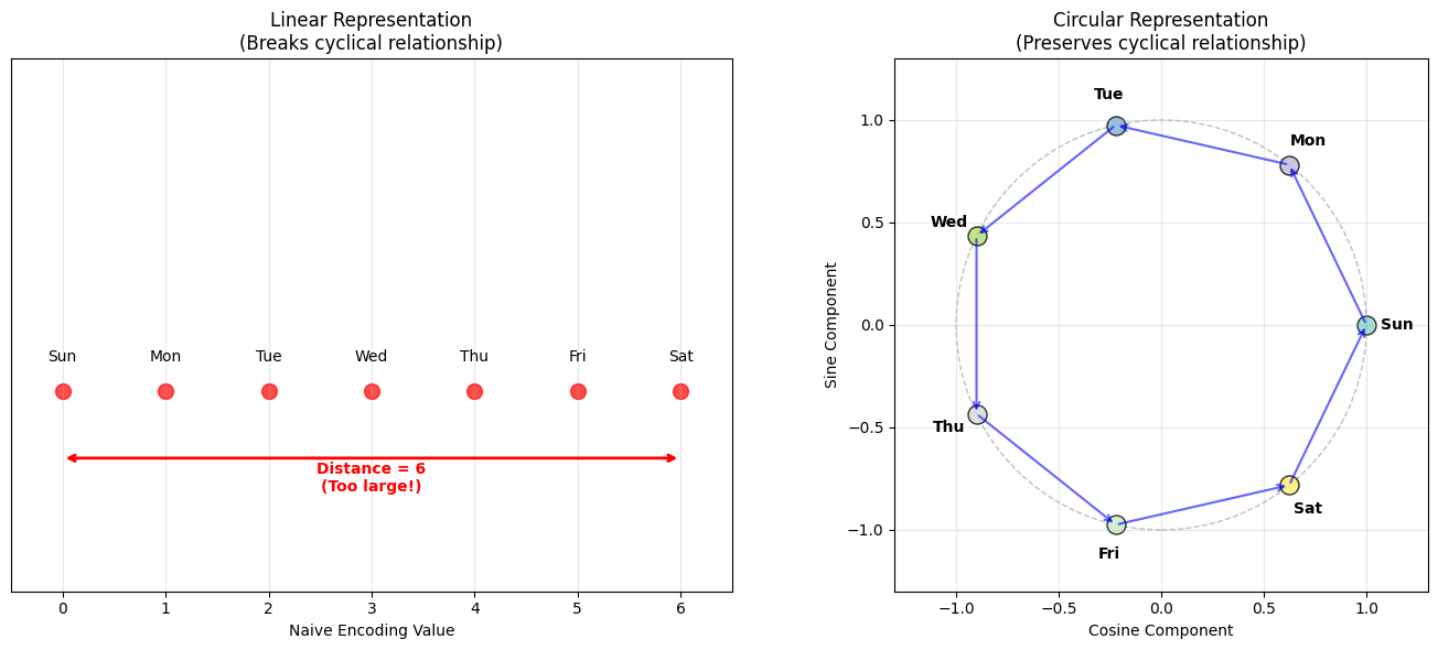
Cyclische informatie
Bij bepaalde schalen is er cycliciteit. Denk bijvoorbeeld aan de seizoenen (“winter” < “lente” < “zomer” < “herfst” < “winter” < ...) of dagen van de week (“zondag” < “maandag” < “dinsdag” < “woensdag” < “donderdag” < “vrijdag” < “zaterdag” < “zondag” < “maandag”, ...). Als we deze informatie zomaar vertalen naar numerieke waarden (bv. ) maken we een fout door bijvoorbeeld te stellen dat het verschil tussen “zaterdag” en “zondag” 6 is en tussen “zondag” en “maandag” 1 of dat “zaterdag” “zondag” en “zondag” “maandag”.
We kunnen dit oplossen door een 2-dimensionele matrix representatie van deze data te maken (dus in plaats van ). Daarbij vertalen we ieder ordinaal label naar een overeenkomstig 2D coördinaat op een cirkel.
Source
# Define days of the week
days = ["Sunday", "Monday", "Tuesday", "Wednesday", "Thursday", "Friday", "Saturday"]
n_days = len(days)

# Problem: Naive numerical encoding
naive_encoding = np.arange(n_days)  # [0, 1, 2, 3, 4, 5, 6]
print("🚫 Naive encoding of days:")
for i, day in enumerate(days):
    print(f"  {day}: {naive_encoding[i]}")

# Calculate distances between consecutive days using naive encoding
print("\n❌ Problems with naive encoding:")
print(f"  Distance Saturday → Sunday: {abs(naive_encoding[6] - naive_encoding[0])} (should be 1!)")
print(f"  Distance Sunday → Monday: {abs(naive_encoding[0] - naive_encoding[1])} (correct)")
print(f"  Distance Friday → Saturday: {abs(naive_encoding[5] - naive_encoding[6])} (correct)")

# Solution: Cyclic encoding using trigonometric functions
angles = 2 * np.pi * naive_encoding / n_days  # Convert to angles (0 to 2π)
cyclic_x = np.cos(angles)  # X-coordinate on unit circle
cyclic_y = np.sin(angles)  # Y-coordinate on unit circle

print("\n✅ Cyclic encoding using trigonometric functions:")
for i, day in enumerate(days):
    print(f"  {day}: ({cyclic_x[i]:.3f}, {cyclic_y[i]:.3f})")


# Calculate Euclidean distances between consecutive days using cyclic encoding
def euclidean_distance(p1, p2):
    """
    Calculate the Euclidean distance between two 2D points.

    Parameters
    ----------
    p1 (tuple): First point as (x, y) coordinates
    p2 (tuple): Second point as (x, y) coordinates

    Returns
    -------
    float: The Euclidean distance between the two points
    """
    return np.sqrt((p1[0] - p2[0]) ** 2 + (p1[1] - p2[1]) ** 2)


print("\n✅ Distances with cyclic encoding (all should be similar):")
sat_coords = (cyclic_x[6], cyclic_y[6])
sun_coords = (cyclic_x[0], cyclic_y[0])
mon_coords = (cyclic_x[1], cyclic_y[1])
fri_coords = (cyclic_x[5], cyclic_y[5])

print(f"  Distance Saturday → Sunday: {euclidean_distance(sat_coords, sun_coords):.3f}")
print(f"  Distance Sunday → Monday: {euclidean_distance(sun_coords, mon_coords):.3f}")
print(f"  Distance Friday → Saturday: {euclidean_distance(fri_coords, sat_coords):.3f}")

# Visualization
fig, (ax1, ax2) = plt.subplots(1, 2, figsize=(14, 6))

# Plot 1: Linear representation (naive encoding)
ax1.scatter(naive_encoding, np.zeros_like(naive_encoding), s=100, c="red", alpha=0.7)
for i, day in enumerate(days):
    ax1.annotate(
        day[:3],
        (naive_encoding[i], 0),
        xytext=(0, 20),
        textcoords="offset points",
        ha="center",
        fontsize=10,
    )

# Highlight the problem: Saturday to Sunday distance
ax1.annotate(
    "", xy=(0, -0.1), xytext=(6, -0.1), arrowprops={"arrowstyle": "<->", "color": "red", "lw": 2}
)
ax1.text(3, -0.15, "Distance = 6\n(Too large!)", ha="center", color="red", fontweight="bold")

ax1.set_xlim(-0.5, 6.5)
ax1.set_ylim(-0.3, 0.5)
ax1.set_xlabel("Naive Encoding Value")
ax1.set_title("Linear Representation\n(Breaks cyclical relationship)")
ax1.grid(True, alpha=0.3)
ax1.set_yticks([])

# Plot 2: Circular representation (cyclic encoding)
circle = plt.Circle((0, 0), 1, fill=False, color="gray", linestyle="--", alpha=0.5)
ax2.add_patch(circle)

# Plot days on the circle
colors = plt.cm.Set3(np.linspace(0, 1, n_days))
for i, day in enumerate(days):
    ax2.scatter(cyclic_x[i], cyclic_y[i], s=150, c=[colors[i]], alpha=0.8, edgecolors="black")
    # Position labels slightly outside the circle
    label_x = cyclic_x[i] * 1.15
    label_y = cyclic_y[i] * 1.15
    ax2.annotate(
        day[:3], (label_x, label_y), ha="center", va="center", fontsize=10, fontweight="bold"
    )

# Draw arrows to show cyclical nature
for i in range(n_days):
    next_i = (i + 1) % n_days
    ax2.annotate(
        "",
        xy=(cyclic_x[next_i], cyclic_y[next_i]),
        xytext=(cyclic_x[i], cyclic_y[i]),
        arrowprops={"arrowstyle": "->", "color": "blue", "alpha": 0.6, "lw": 1.5},
    )

ax2.set_xlim(-1.3, 1.3)
ax2.set_ylim(-1.3, 1.3)
ax2.set_aspect("equal")
ax2.set_xlabel("Cosine Component")
ax2.set_ylabel("Sine Component")
ax2.set_title("Circular Representation\n(Preserves cyclical relationship)")
ax2.grid(True, alpha=0.3)

plt.tight_layout()
plt.show()
🚫 Naive encoding of days:
Sunday: 0
Monday: 1
Tuesday: 2
Wednesday: 3
Thursday: 4
Friday: 5
Saturday: 6
❌ Problems with naive encoding:
Distance Saturday → Sunday: 6 (should be 1!)
Distance Sunday → Monday: 1 (correct)
Distance Friday → Saturday: 1 (correct)
✅ Cyclic encoding using trigonometric functions:
Sunday: (1.000, 0.000)
Monday: (0.623, 0.782)
Tuesday: (-0.223, 0.975)
Wednesday: (-0.901, 0.434)
Thursday: (-0.901, -0.434)
Friday: (-0.223, -0.975)
Saturday: (0.623, -0.782)
✅ Distances with cyclic encoding (all should be similar):
Distance Saturday → Sunday: 0.868
Distance Sunday → Monday: 0.868
Distance Friday → Saturday: 0.868
Missing data
In veel tabelgegevens kan niet voor ieder item steeds de volledige reeks observaties gemaakt worden (denk bijvoorbeeld aan een temperatuursensor die een fout geeft). In sommige gevallen kunnen machine learning algorithmes daar perfect mee om (bv. Decision trees, Kalman Filters), maar veel algorithmes verwachten volledige input. Soms kan beslist worden om alle rijen te verwijderen waarvoor er een of meerdere missing values zijn - als daardoor nog genoeg data overblijft voor het leeralgorithme. Er kan ook beslist worden om die missing values op een zinvolle manier in te vullen (bv. door het gemiddelde van alle observaties). In dat geval spreekt men over missing value imputation.
g = np.nan
print(g)
nan
a = np.array([5, 8, np.nan, 4])
print(a)
print(a[~np.isnan(a)])  # Filter out NaN values
[ 5. 8. nan 4.]
[5. 8. 4.]
# Missing value imputation: Replace NaN with the mean of non-NaN values
a[np.isnan(a)] = np.mean(a[~np.isnan(a)])
print(a)
[5. 8. 5.66666667 4. ]
Eens we de informatie waarin we patroonherkenning willen doen vertaald hebben naar numerieke waarden, verzamelen we ze in een feature matrix/tensor met items in de rijen en verschillende features in de kolommen.
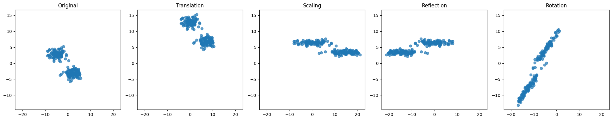
Data translatie, schaling, reflectie en rotatie
We zullen zien dat er veel toepassingen zijn waar data op een bepaald moment getransformeerd worden via translatie, schaling, reflectie en/of rotatie. Dit is zeer transparant en efficient in computationele zin als we data uitdrukken als tensors:
Translatie: De data wordt uitgedrukt (of gekwantificeerd) ten opzichte van een ander nulpunt in de ruimte. We kunnen anderzijds ook zeggen dat de data wordt verschoven in de ruimte. In het geval van een input matrix met data punten in dimensies krijgen we:
met en
Schaling: De data worden uitgedrukt ten opzichte van een andere schaal op één of meerdere assen in de ruimte (of: de data wordt uitgerokken).
Reflectie[2]: De data wordt gespiegeld ten opzichte van één of meerdere assen in de ruimte.
met
Rotatie: De data worden uitgedrukt ten opzichte van een ander orthogonaal assenstelsel in de ruimte, met dezelfde oorsprong.
met een orthogonale rotatie-matrix
Source
# Generate 100 2D Gaussian datapoints
mean1 = [2, -3]
mean2 = [-5, 3]
cov = [[3, 0], [0, 1]]  # Different std deviations for x and y
X = np.vstack([rng.multivariate_normal(mean1, cov, 100), rng.multivariate_normal(mean2, cov, 100)])

# Define transformations
# Translation
c = np.array([5, 10])
T = X + c
# Scaling
s = np.array([2, 0.5])
S = T * s
# Reflection across y-axis
R = S * np.array([-1, 1])
# Rotation by 45 degrees
theta = np.radians(45)
rotation_matrix = np.array([[np.cos(theta), -np.sin(theta)], [np.sin(theta), np.cos(theta)]])
D = R @ rotation_matrix.T

# Plot original and transformed data
fig, axs = plt.subplots(1, 5, figsize=(20, 4))
titles = ["Original", "Translation", "Scaling", "Reflection", "Rotation"]
datasets = [X, T, S, R, D]

# Calculate global axis limits to keep ranges constant
all_data = np.concatenate(datasets, axis=0)
x_min, x_max = all_data[:, 0].min(), all_data[:, 0].max()
y_min, y_max = all_data[:, 1].min(), all_data[:, 1].max()

# Add some padding
x_padding = (x_max - x_min) * 0.05
y_padding = (y_max - y_min) * 0.05
x_min -= x_padding
x_max += x_padding
y_min -= y_padding
y_max += y_padding

for ax, data, title in zip(axs, datasets, titles, strict=False):
    ax.scatter(data[:, 0], data[:, 1], alpha=0.7)
    ax.set_title(title)
    ax.set_xlim(x_min, x_max)
    ax.set_ylim(y_min, y_max)

plt.tight_layout()
plt.show()